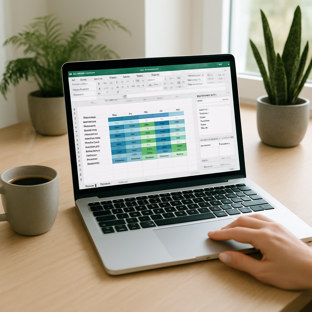
The pivot table remains the fastest tool to transform data lists into actionable analyses. Whether you want to summarize sales by region, track monthly trends, or calculate market shares, Excel offers a dedicated interface that makes these operations accessible — provided you know how to prepare the data and choose the right fields. This guide walks you through step-by-step, from formatting the source table to advanced tips (groupings, calculated fields, slicers), with concrete examples and solutions to common errors.
Somaire
In brief
🗂️ Prepare clean data: consistent columns, no empty rows, unique headers. A pivot table does not like mixed structures.
⚙️ Insert in 3 clicks: select your table → Insert → Pivot Table. Then drag and drop fields into Rows, Columns, Values, and Filters.
🔎 Dynamic analysis: use slicers and grouping to explore data without modifying the source. For custom calculations, create a calculated field.
💡 Performance & maintenance: work with an Excel Table (Ctrl+T) to automatically extend the range, refresh, and check connections if results seem incorrect.
What is a pivot table?
A pivot table is a summary view built from a tabular source. Instead of manually creating subtotals and groupings, you drag the fields you are interested in and Excel automatically calculates totals, averages, counts, and other aggregations. The strength of the pivot table lies in its modularity: you reorganize the structure without touching the original data, which facilitates exploration and hypothesis validation.
When to use a pivot table rather than a formula?
A pivot table is preferred when the goal is to quickly aggregate volumes, compare segments, or produce periodic reports. Formulas (SUMIFS, SUMPRODUCT, VLOOKUP/X) are suitable for targeted calculations or fixed dashboards. However, if you want to change the view (e.g., switch from grouping by product to grouping by salesperson) with a few drags, the pivot table clearly wins.
Preparing data: best practices
Before inserting a pivot table, check the quality of the source table. Several simple rules avoid later errors:
- Each column must contain only one type of information (dates, text, numbers).
- Headers must be unique, short, and explicit (e.g.: Date, Region, Product, Quantity, Sales).
- Avoid empty rows or columns in the range: they break automatic detection.
- Convert the range into a Table (Ctrl+T) so the pivot table automatically adjusts when you add rows.
Create a Pivot Table Step by Step
Step 1 — Select your range
Select a cell in your table or highlight the range. If you are using an Excel Table, any cell in the table is enough; Excel will automatically understand the entire range and new records will be included after refreshing.
Step 2 — Insert the pivot table
Go to the Insert tab → Pivot Table. Excel offers to insert the pivot table in a new sheet or in the active sheet. To keep a file organized, often choose a new sheet clearly named (e.g.: “PivotTable_Sales”).
Step 3 — Build the view with fields
The Pivot Table Fields area displays your headers. Drag and drop:
- To Rows: the detail axes (e.g. Region, Product)
- To Columns: the cross categories (e.g. Year, Quarter)
- To Values: the measure to aggregate (e.g. Sum of Sales, Count of orders)
- To Filters: global filters applicable to the pivot table (e.g. Seller, Channel)
Experiment: moving a field from Rows to Columns instantly changes the analysis perspective.

Step 4 — Choose the aggregation type
By default, Excel uses SUM for numbers and COUNT for text. To change: click on the arrow of the field in Values → Value Field Settings → choose Average, Max, Min, Standard Deviation, or a Custom Calculation. This flexibility allows adapting the analysis to the nature of the KPI.
Step 5 — Group items (dates, values)
Grouping is useful for dates (days → months → quarters) and numbers (value ranges). Select the items to group → right-click → Group. For dates, you can automatically group by month, quarter, year — handy for time series.
Concrete example: analyzing monthly sales
Imagine a table with columns: Date, Region, Product, Quantity, Sales. A simple pivot table could show Products in Rows, Months (grouped from Date) in Columns, and Sum of Sales in Values. You quickly get a matrix-type table where each cell represents the revenue by product/month, with totals at the base and column.
| Area | Usage | Tip |
|---|---|---|
| Rows | Detail by entity (Product, Seller) | Place hierarchies with the most detailed level at the bottom |
| Columns | Compare periods or categories | Group dates to avoid one column per day |
| Values | Measures: Sum, Count, Average | Rename the value for more clarity (e.g. “Total Sales”) |
Slicers and timeline: explore without breaking
Slicers create visual buttons to filter the pivot table. They are ideal for presentations because they make navigation intuitive. For time data, the Timeline offers control over periods (days, months, quarters, years). Slicers and Timeline can be linked to one or more pivot tables if you work from the same data model.
Calculated fields and custom calculations
When standard functions are not enough, a calculated field allows you to add a virtual column to the pivot table based on an expression (e.g. Margin = Sales – Cost). In the Analyze menu → Fields, Items & Sets → Calculated Field, define the formula. Note that calculated fields use aggregated totals, so for some ratios (e.g. weighted average) you may sometimes need to add the corresponding column to the source.
Refresh, extend and manage the source
Add rows to the source Table and right-click on the Pivot Table → Refresh. If your Pivot Table points to a fixed range, convert it to a Table or adjust the range via “Change Data Source.” For external connections (SQL, Power Query), consider scheduling refreshes or using Refresh All.
Common errors and quick fixes
- Missing values: check that the data type is correct (text vs number).
- Duplicate entries: ensure that each record is unique according to business logic.
- Field not found after adding: refresh the Pivot Table or convert the range to a Table.
- Slow performance: limit the displayed detail, use the data model/Power Pivot for large volumes.
Shortcuts and pro tips
- Ctrl+T: convert a range to a Table.
- Alt+N+V: quickly insert a Pivot Table.
- Double-click on a total to extract underlying data (the “drill down” function).
- Use “Show Values As” for quick calculations (percentage of total, difference, etc.).
When to switch to Power Pivot or the data model
The native Pivot Table is powerful but reaches its limits with multiple relationships between tables or very large volumes. Power Pivot and the data model allow importing multiple related tables, writing DAX measures for complex calculations, and improving performance. If you regularly work with warehouses or large exports, this is the path to consider.
FAQ
How to correctly group dates in a Pivot Table?
Select the date cells in the Pivot Table, right-click → Group. Choose Month, Quarter, Year according to your need. If Excel does not offer the grouping option, verify that the dates are properly formatted as Date and that there is no mixed text.
Why don’t my new records appear in the Pivot Table?
If the source is a static range, the Pivot Table will not update automatically. Convert the range to a Table (Ctrl+T) or use “Change Data Source.” Then, right-click on the Pivot Table → Refresh.
Can I have multiple Pivot Tables linked to the same slicer?
Yes. Select a slicer → Slicer Tools → Report Connections → check the Pivot Tables you want to control simultaneously. This synchronizes filters across multiple reports.
What is a calculated field and when to use it?
A calculated field adds a measure based on a formula within the Pivot Table (e.g., Margin = Sales – Cost). Use it for simple ratios or calculations using fields already present. For more advanced calculations or those requiring different granularities, prefer a calculated column in the source or a DAX measure via Power Pivot.
{
“@context”: “https://schema.org”,
“@type”: “WebPage”,
“about”: {
“@type”: “Thing”,
“name”: “Create a pivot table in Excel”
},
“keywords”: [“Pivot Table”, “pivot table”, “Excel”, “slicer”, “calculated field”]
}