
| Key Points | Details to Remember |
|---|---|
| 📊 | Understand the concept of radial axes and variables. |
| 📝 | Prepare the data according to the ideal layout. |
| ➕ | Insert the radar chart via the Insert tab. |
| 🎨 | Customize colors, legends, and axes. |
| 📉 | Compare the radar chart to other types of charts. |
| 🤖 | Automate creation using templates and macros. |
Exploring the many ways to represent data in Excel, the radar chart (or spider chart) stands out for its ability to juxtapose multiple indicators on radiating axes. You can immediately see the strengths and weaknesses of a series of elements, making it a popular tool for comparative analyses, skills assessments, or performance mapping. Don’t worry if you’ve never created one before: this guide will walk you through step-by-step, from data preparation to the most refined formatting.
Somaire
What is a radar chart?
Definition and use cases
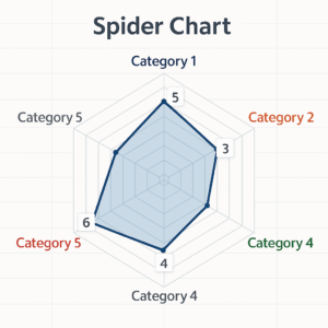
On a radar chart, each axis starts from the center to represent a variable. Values are positioned along these axes and then connected to form a polygon. You will find this type of representation in qualitative assessments (skills, customer satisfaction), multiple comparisons (product performance), or even risk evaluations. The eye immediately perceives the balance or imbalance among the different parameters.
Advantages and limitations
The main strength lies in visual synthesis: at a glance, you can gauge the coherence of a multi-faceted profile. However, if you multiply too many axes, the chart becomes unreadable and loses its usefulness. For temporal data or very fine distributions, other types such as the combined chart will be more suitable.
Prepare your data
Ideal layout
Before inserting the diagram, organize your data in a table: the first column lists the names of the axes (for example “Quality,” “Cost,” “Time”), and each following column corresponds to a series of values. Be sure to give a clear title to each series: this will directly serve as the legend in your chart.
Formatting tips
- Avoid empty cells: Excel extends the axis up to the maximum value present.
- Use consistent numeric formats to avoid distorting the scale.
- Prefer an identical scale on all axes to ensure coherent reading.
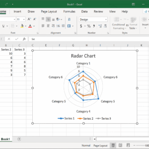
Steps to create the radar chart in Excel
Selecting data
Select the range including headers and values. If you want to add or remove a series later, it’s better to position your table next to the chart so you can extend the selection by drag-and-drop.
Inserting the radar chart
Go to the Insert tab then to the Charts group. Choose “Radar” and select the variant that suits you: without markers, with markers, or filled. The fill gives a more “solid” look while the markers highlight the value points.
Customization and Style
Once the canvas is in place, click on your chart to display the Design and Format tabs. Modify:
- The colors of each series.
- The thickness and style of the lines.
- The background and borders.
Refine and Interpret the Results
Adjust Axes and Scales
Double-click on the radial axis to open the formatting pane. You can:
- Set a fixed maximum value.
- Change the tick mark intervals.
- Change the label layout (horizontal, vertical).
Add Labels, Legends, and Colors
Data labels are useful for displaying values directly. Enable them in Chart Elements then adjust their position. The legend, meanwhile, can be moved or hidden as needed.
Compare with Other Charts
Depending on your goals, the radar chart can be complemented or replaced by:
- To break down a stepwise flow, the waterfall chart remains essential.
- To juxtapose bars and lines, consider the combo chart.
- For temporal planning, nothing beats a Gantt chart.
- If you want to dynamically filter the displayed series, a dynamic drop-down list can control your chart.
Best Practices and Advanced Tips
Save a Chart Template
Once your radar chart is perfected, right-click on the visual and select Save as Template. You will retrieve all your customizations in the “Templates” gallery for other projects.
Automate with Macros
If you regularly generate similar radars, a VBA macro can:
- Import and structure data.
- Insert the chart with your styles.
- Automatically save the file.
Tip: first record your actions using the macro recorder to get the VBA framework, then adapt it to your needs.
FAQ
How do I add multiple series to an existing radar chart?
Right-click on the chart, choose Select Data then Add a new series by specifying its range of values and name.
Can I display a radar chart with a minimum value other than zero?
Yes, in the axis formatting pane, set the desired minimum value. Excel will adjust the scale accordingly.
Is the radar chart available in all versions of Excel?
It has been available since Excel 2013. Later versions have simply improved the customization interface.
How do I print a radar chart in high quality?
First export it as an image (right-click > Save as Picture) then insert it into a Word or PowerPoint document before printing; this way you control the resolution.
How do I remove the gridlines behind my radar chart?
Select the chart, go to Layout > Gridlines and uncheck the horizontal and vertical gridline options.
{
“@context”: “https://schema.org”,
“@type”: “WebPage”,
“about”: {
“@type”: “Thing”,
“name”: “Excel radar chart”
},
“keywords”: [“radar chart”, “Excel”, “data series”, “axes”, “visualization”]
}