
| Key Points | Details to Remember |
|---|---|
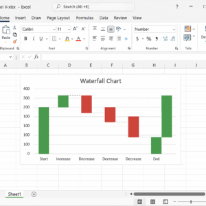
| 📊 Definition | Waterfall chart illustrates the successive gaps between starting and ending values. |
| 🛠️ Preparation | Structure your data in columns: category, value, and type (positive, negative, total). |
| 📈 Creation | Insert the native chart or build an alternative version with a stacked chart. |
| 🎨 Customization | Modify colors, labels, and axes to highlight key points. |
| ⚠️ Best Practices | Avoid too many details and prioritize readability. |
A waterfall chart, often called Waterfall, highlights the successive changes from an initial value to a final value, detailing intermediate increases and decreases. Rather than overwhelming the reader with a long list of numbers, this visual allows instant grasp of positive and negative contributions to the overall trend. If you have already explored a combined chart, you know how much the choice of chart type can transform your message: the Waterfall brings out the financial or operational story behind a table of numbers.
Somaire
What is a waterfall chart and why adopt it?
At first glance, it looks like a succession of aligned bars, but its interest lies in the visual continuity that connects each segment. Each column starts from the top of the previous one, except for intermediate or final totals which rest on the horizontal axis. Thus, you immediately distinguish the steps that drive progress and those that slow it down. The finance, marketing, and logistics sectors use it to illustrate a budget, revenue evolution, or the impact of variable costs.
Prepare your data for an effective Waterfall
Structure the data table
Before any manipulation, organize your columns as follows:
- Category: name of the step (e.g., “Sales”, “Fixed Costs”, “Investments”).
- Value: associated amount (positive or negative).
- Type: specify “Positive”, “Negative” or “Total”.
This labeling will allow Excel to automatically recognize neutral bars representing totals. Without this precision, each element would be stacked or aligned at zero, which would confuse the cumulative logic.
Calculate cumulative starting points
The trick is to determine for each step where the bar starts. You can create a new column “Starting Point”:
| Category | Value | Starting Point |
|---|---|---|
| Start | €100,000 | 0 |
| Sales | €20,000 | €100,000 |
| Costs | -€15,000 | €120,000 |
| Total | €105,000 | 0 |
To automate these calculations, the SUMIF function can be useful if your data is spread over several ranges and you need to aggregate by category.
Create the waterfall chart in Excel
Use the native type (Excel 2016 and later)
- Select your structured table.
- In the Insert tab, click on Waterfall Chart (icon representing offset bars).
- Excel automatically generates the transition bars and totals, respecting the “Type” annotations.
Alternative method via stacked column chart
If your version of Excel does not directly offer the Waterfall chart, build it with two stacked series:
- Insert a stacked column chart on the pair “Starting point” and “Value”.
- Format the “Starting point” series with no fill to make it invisible.
- Adjust the colors of the “Value” series according to the sign (positive or negative).
- Set the “Total” series as a special category, aligned on the axis.
Then, you can use the “Change Chart Type” option to make it a true combined chart, in case of mixing visual elements.
Customize your chart for better clarity
- Apply contrasting colors: green for gains, red for losses, and neutral for totals.
- Add data labels to the columns to indicate precise amounts.
- Remove unnecessary elements (thick grids, drop shadows) to lighten reading.
- Adjust the vertical axis scale to avoid the “crushed” effect of small variations.
Best practices and pitfalls to avoid
- Do not accumulate too many steps; limit yourself to the essentials so the visual does not get lost.
- If your data comes from an external system, remember to refresh after importing a poorly formatted CSV file.
- Check that each “Total” is properly identified as such, otherwise Excel may stack the bar incorrectly.
- Avoid missing null values: replace them with zero to avoid distorting the total.
Concrete use cases
Financial services frequently use the Waterfall to break down net profit, while marketing managers illustrate the cumulative impact of several advertising campaigns. In project management, this chart often complements a Gantt chart by highlighting budget progress or resource variations from one phase to another.
FAQ
1. What is the main advantage of a waterfall chart?
It summarizes the steps of a change by visually distinguishing increases and decreases, without overwhelming the user with a long table.
2. Can a Waterfall be updated automatically if the data changes?
Yes: if your source table is structured and you add new rows, select your chart and choose “Select Data” to adjust the range. You can also use a PivotTable coupled with a dynamic named range.
3. How to highlight an intermediate step?
Mark it as “Total” in the Type column. Excel will treat it as a stop on the axis, without stacking an invisible value.
4. My Excel does not offer the Waterfall type, what should I do?
Follow the stacked columns method: create two series (starting point and value) then hide one to manually compose the waterfall.
5. Can I combine a waterfall chart with a trendline?
In theory, yes, by using a combined chart, but the result can become confusing. It is better to separate the two visuals to preserve clarity.
{
“@context”: “https://schema.org”,
“@type”: “WebPage”,
“about”: {
“@type”: “Thing”,
“name”: “Waterfall chart in Excel”
},
“keywords”: [“Waterfall”, “Excel”, “waterfall chart”, “cumulative data”, “visualization”]
}