
Do you need to visualize a sales process, a conversion funnel, or simply display progress toward a goal? Excel offers two particularly effective chart types for these uses: the funnel chart and the gauge chart. Contrary to what one might think, these visualizations are not reserved for data visualization experts. With the right techniques, you can master them quickly and transform your raw data into impactful representations.
📊 Funnel Chart: ideal for visualizing the stages of a conversion or sales process. Each section represents a phase, with a width proportional to its value. Perfect for identifying bottlenecks.
🎯 Gauge Chart: replicates the display of a car dashboard with a needle indicating progress toward a goal. Excellent for tracking KPIs or completion percentages.
⚡ Alternative Methods: neither the funnel nor the gauge is natively available in Excel. You need to use clever combinations of standard charts (pie, bars, doughnut) to recreate them.
🛠️ Advanced Customization: conditional colors, 3D effects, conditional formatting – discover how to push Excel to its limits for professional visuals.
Somaire
Why choose a funnel or gauge chart?
Before diving into the technical details, understanding the usefulness of each chart will save you time by avoiding the wrong choice. The funnel excels in representing sequential processes where values gradually decrease. Imagine a sales pipeline: 1000 initial leads, 500 demos, 200 quotes, 50 closed sales. Each step narrows, visually forming a funnel. The width of each section corresponds to its numeric value, allowing you to immediately spot where the biggest losses occur.
The gauge, on the other hand, is used to measure performance against a set goal. Think of a speedometer: the needle shows where you are between the minimum and maximum. It’s perfect for displaying a fill rate, a goal achievement percentage, or any metric measured “on a scale.” Unlike a simple numeric percentage, the gauge offers an immediate and intuitive visualization of the situation.

Create a funnel chart in Excel: step-by-step method
Excel does not offer a native “funnel” type in its chart gallery. The technique therefore consists of repurposing a stacked bar chart and applying some formatting tricks. Follow the guide.
Prepare your data for the funnel
Your source table must contain at least two columns: the steps of your process and the corresponding values. For a symmetrical funnel, you will need to add a calculated “Spacing” column that will be used to center the bars. The spacing value for each row corresponds to (max(values) – step value) / 2. This manipulation creates an equal offset on both sides of the bar, giving the illusion of a funnel.
| Steps | Values | Spacing |
|---|---|---|
| Leads | 1000 | 250 |
| Demos | 500 | 375 |
| Quotes | 200 | 450 |
| Sales | 50 | 475 |
Build and format the chart
Select your three columns and insert a stacked bar chart. In the formatting pane, make the “Spacing” series transparent (no fill color). You already get the funnel shape, but the steps are in the wrong order. Right-click on the vertical axis, axis format, and check “Categories in reverse order”.
The magic happens: your bars now appear in the correct order, with equal spacing on both sides. Remove the legend, adjust the colors so they harmoniously gradient from top to bottom of the funnel, and add data labels on each section. For a professional look, slightly space the bars (the “Gap Width” option in series format) to about 50%.
Pro tip: use conditional data formatting so that the color of each section progressively darkens as you go down the funnel, enhancing the visual depth effect.
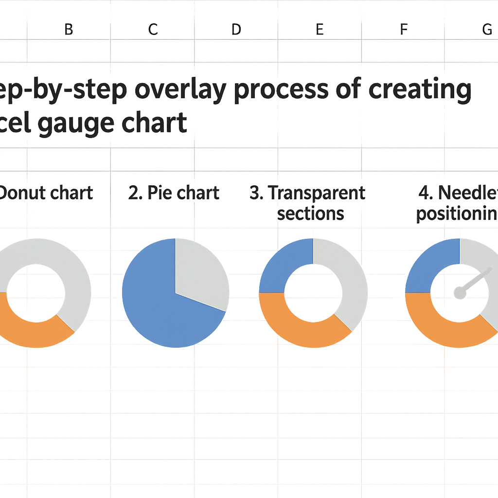
Build a gauge (speedometer) chart in Excel
The gauge requires a bit more gymnastics but the result is worth the effort. Generally, a doughnut chart is used for the dial and a pie chart for the needle, all cleverly superimposed.
Data setup for the gauge
Prepare three distinct data ranges. The first for the dial (usually three segments: 0-50%, 50-75%, 75-100% with different colors). The second for the needle, which requires a precise calculation based on your value to display. The third contains the actual value and the remainder (complementary value to 100%).
The needle calculation is crucial: angle = (value * 180) / max_value. Since pie charts in Excel use 360°, a half-circle gauge uses 180°. If your value is 75 out of 100 max, the angle will be (75*180)/100 = 135°. Your needle sector will represent 135° and the complementary sector 45°.
Assembly and overlay of charts
First create a doughnut chart with your dial data. Format it with your chosen colors (red for critical zone, orange for warning, green for safe). Then create a pie chart with your needle data. Overlay them by copying and pasting the pie chart onto the doughnut, then via “Change Chart Type” > “Combo”.
Make the needle’s complementary sector fully transparent and color the needle sector black or dark gray. Perfectly align the two charts and remove all unnecessary elements. Add a text box linked to your value cell to display the number at the center of the gauge.
Common mistakes and how to avoid them
Even with the best method, some technical pitfalls await users. Here are the most common ones and how to defuse them.
- The funnel appears unbalanced: check your spacing calculations. Each value must be (max – value)/2. An absolute/relative reference error in the formula is often the cause.
- The gauge needle does not point correctly: review your angle calculation. Remember that the standard gauge covers 180°, not 360°. Use Excel’s ROUND function to avoid decimal angles that create visual inaccuracies.
- Labels overlap or disappear: in the data label format, choose “inside” or “outside” position depending on the available space. For small values, manually add text boxes.
Excessive customization can also harm readability. Avoid pronounced 3D effects on funnels that distort proportions, and limit your color palette to 3-4 shades maximum for gauges. Clarity takes precedence over the “wow” effect.
Going further: automation and dynamic dashboards
Once mastered, these techniques become much more powerful when integrated into interactive dashboards. Link your charts to editable cells via XLOOKUP formulas to vary the displayed data according to a selection. Combine funnel and gauge with other visuals like combined bar and line charts to offer a complete overview.
For complex processes, use SUMIFS and COUNTIFS to dynamically calculate the values of each funnel stage based on filtered criteria. Imagine a sales funnel that updates automatically when you select a specific region or period.
Regular import of data from external CSV files can also feed your charts. Automate updates by importing your raw data into a dedicated sheet, then reference these cells in your chart construction table.
FAQ: Funnel and gauge charts in Excel
Can these charts be created on Excel Mac?
Absolutely. The described methods work on all recent versions of Excel, Windows and Mac alike. The interface may vary slightly, but the basic functionalities are identical.
How to automatically update charts when data changes?
Excel automatically updates charts linked to cell ranges. If you modify the source values, the funnel or gauge recalculates instantly. For dynamic structures, use Excel tables (Insert > Table) rather than simple ranges.
Are there pre-made templates to save time?
Yes, Microsoft offers templates in its online gallery that sometimes include these types of charts. You can also find specialized templates on Excel resource sites. But understanding manual construction remains invaluable to adapt them to your specific needs.
What alternatives exist if these methods seem too complex?
Power BI offers native funnel and gauge visualizations, much easier to implement. If you regularly work with this type of chart, consider this tool. For occasional use in Excel, the manual method remains the most flexible.