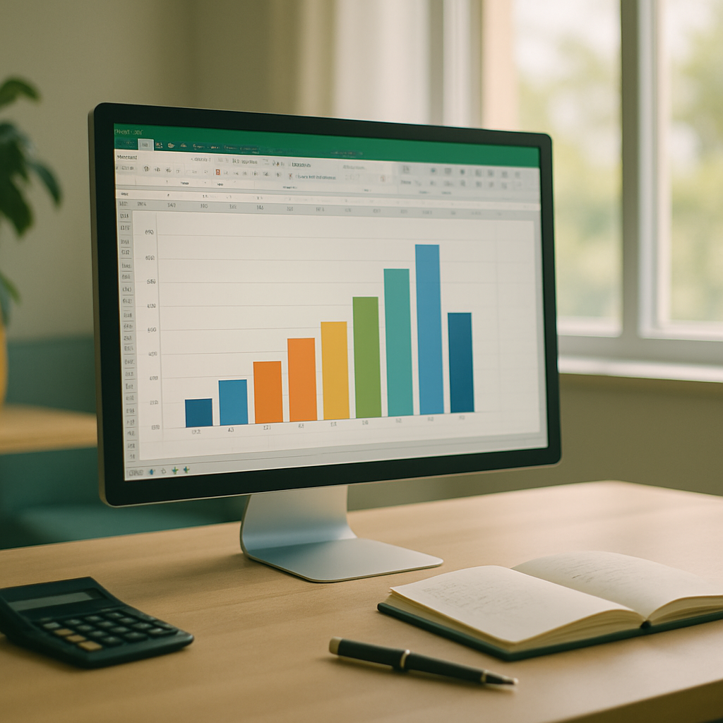
| Key Points | Details to Remember |
|---|---|
| 📊 Definition | Visualizes the distribution of data according to intervals |
| 🔢 Classes | Group values into appropriate bins |
| 🎯 Frequency | Calculate how many observations fall into each class |
| 🛠️ Excel Tools | Use the Data Analysis tab or the Charts tool |
| 🎨 Customization | Modify colors, axes, and legend for better clarity |
| 📈 Interpretation | Analyze the shape of the chart and concentrations |
When you need to understand the distribution of a set of numerical data, the frequency histogram stands out as an essential visual tool. Excel offers several methods to generate this type of chart, whether by directly using the built-in data analysis or manually creating classes. This guide takes you from preparing your data table to the detailed interpretation of the result, providing tips and best practices for a professional output.
Somaire
What is a Frequency Histogram?
One might think it is just a set of bars, but a frequency histogram has an important statistical dimension: each bar represents the number of occurrences within a range of values called a “class.” Unlike a simple bar chart, the histogram merges contiguous observations to reveal data density and areas of concentration or rarity.
Prepare Your Data
First of all, list your values in a separate column. Most often, an additional column is added for class boundaries: lower and upper bounds. Calculate the range (max – min) then choose the number of classes, generally between 5 and 15 depending on the sample size. A simple formula (=(MAX(range)–MIN(range))/number_of_classes) allows you to determine the width of each class.
Create a Frequency Histogram Step by Step
Select the Data
If you already have a table showing the class column and the frequency column, select the entire table. Otherwise, first prepare the list of class boundaries then use the COUNTIFS function to count the values within each interval. For example: =COUNTIFS(data, ">="&lower_bound, data, "<"&upper_bound).

Insert the chart
With your selected table, go to the Insert tab and then choose Histogram or Histogram or Bar Chart depending on your version of Excel. The standard “Histogram” option will automatically adjust the bins, but you can opt for a “Pareto Histogram” if you want to highlight the accumulation of frequencies; this is a subtle nod to the Pareto chart to emphasize the importance of the first bins.
Adjust the class intervals
If Excel does not perfectly meet your statistical expectations, click on the chart, then on Format Axis. You can manually set the class interval (“Bin Width”) and choose whether to have a duplicated border or not. This helps to standardize your bins if your data contains extreme points.
Customize the appearance
A striking result comes from modifying the bar colors, adding data labels, and adjusting the axes. Select a bar, right-click on Format Data Series and choose the style that aligns with your graphic charter. At this stage, it is common to combine your histogram with a combined chart with secondary axes to juxtapose counts with cumulative percentages.

Use and interpret your histogram
Once your histogram is in place, observe its shape: a symmetrical distribution may indicate a normal distribution, while asymmetry reveals biases toward one extreme. To highlight the most central bins, nothing beats a waterfall chart that illustrates the progressive accumulation of cumulative frequencies. You can also insert small sparklines in adjacent cells to offer a dynamic overview of trends by bin.
Advanced tips
- Use Excel’s Data Analysis tool (add-in to be activated in Excel add-ins) to generate histograms with one click.
- Add a density curve by plotting a combined chart with the theoretical frequency of a given distribution.
- Use conditional formatting to automatically color bars beyond a critical threshold.
FAQ
- How to change the number of bins after insertion?
- Open the Format Axis pane, then adjust the “Bin Width” or “Number of bins” value according to your preference.
- Can I create a histogram if my data is already sorted?
- Yes: Excel bases itself on the total range of values. Even sorted, your data will be grouped into bins in the same way.
- What is the difference between a histogram and a bar chart?
- A bar chart compares independent categories, while a histogram uses contiguous bins to represent a continuous distribution.