
| Key Points | Details to Remember |
|---|---|
| 💡 Definition of Sparkline | Visualize the trend of a data series within a single cell |
| 📊 Chart Types | Choose between line, column, or win/loss depending on the goal |
| 🛠️ Insertion | Use the Insert tab > Sparkline |
| ⚙️ Customization | Adjust scale, colors, and styles |
| 🔄 Dynamic ranges | Update automatically via formulas or dynamic dropdown list |
| 🎯 Applications | Integrate into reporting and dashboards |
Sparkline charts provide a compact and visual overview of the evolution of your data without cluttering your spreadsheet. At a glance, you identify trends, peaks, and troughs. While the idea seems simple, mastering advanced options can transform a basic report into a responsive and impactful dashboard.
Somaire
What is a Sparkline chart?
Concretely, a Sparkline is a mini-chart inserted into a cell. It has no axes or legend but focuses on the essentials: the evolution of a series of values. Popular among those who design financial or operational reports, it facilitates quick comparison between rows or columns without switching to a bulky chart.
Why adopt Sparklines in your workbooks?
The main advantage lies in visual synthesis. Instead of scanning columns of numbers, you immediately perceive the data dynamics. This makes tables more readable and encourages exploring anomalies or growth periods. Moreover, since their insertion is very lightweight, the file remains quick to open and handle.
The three types of Sparkline available
Line Sparkline
To represent a trend curve, the line Sparkline draws a smooth path between each point. It is the ideal tool if you want to display rises and falls continuously, like a mini stock chart.
Column Sparkline
This variant turns each value into a vertical bar. Useful for instantly comparing volumes or totals, it resembles classic histograms while occupying just one cell.
Win/Loss Sparkline
Designed to signal successes and failures (positive vs negative values), the Win/Loss Sparkline creates a checkerboard effect: positive elements go up, negatives go down. Perfect for tracking the result of a series of tests or daily sales.
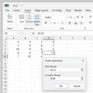
Step-by-step insertion of a Sparkline
1. Select the data series
Start by highlighting the cells containing your values. You can choose a linear range or a non-contiguous selection by holding the Ctrl key. The idea is to prepare your Sparkline from a clear interval.
2. Access the Insert tab
Go to the ribbon and click Insert > Sparkline. Three options appear: Line, Column, or Win/Loss. Select the one that best fits the analysis you want to perform.
3. Define the destination cell
Excel then asks you to choose the location of your mini-chart. Click on the cell where you want the Sparkline to appear. It is possible to propagate the same formatting to multiple cells by dragging the fill handle.
4. Confirm and observe
Once the setup is complete, confirm. Your Sparkline draws instantly. You can immediately spot extreme points and evaluate performance.
Advanced Customization
Style and Display Options
By selecting your Sparkline, a new Design tab appears. You can modify:
- the color of the line or bars,
- the markers for high, low, first, and last points,
- the thickness of the line or bar.
The goal is to make each mini-chart clearly identifiable within a dense table.
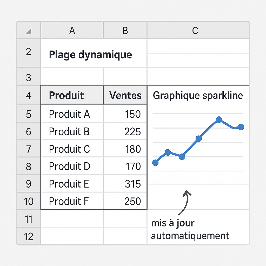
Dynamic Ranges and Formulas
To have your Sparklines adapt to the addition of new rows, you can use formulas. Using OFFSET combined with a counter makes the range automatic. You can even combine this approach with XLOOKUP to pull data based on a specific criterion. If you want to display only filtered totals, incorporate a function such as SUMIF in your source range.
Combining Sparklines with Other Charts
Sometimes a table offers both Sparklines and more detailed charts. You can orchestrate a combined chart alongside a Sparkline to provide two levels of analysis: summary and detail.
For example, a Sparkline can illustrate the quarterly trend, while an adjacent histogram breaks down each month.
Best Practices to Adopt
- Maintain a uniform style: use the same colors for similar categories.
- Limit the number of Sparklines per sheet to avoid visual “noise.”
- Add a minimal legend or cell comment to explain the calculation assumption.
- Anticipate printing: ensure Sparklines remain readable at paper size.
- Prefer marking extreme points if you are tracking anomalies.
FAQ
What is a Sparkline in Excel?
It is a miniature chart linked to a data range. It appears without axes or labels to provide an immediate view of the trend.
How do I automatically update a Sparkline when I add data?
By using a dynamic named range via OFFSET or lookup formulas like XLOOKUP, the source range adapts to new cells.
Can I create multiple Sparklines at once?
Yes, after selecting multiple destination cells, define the source range once and confirm: Excel replicates the series in each cell.
Are Sparklines available in all versions of Excel?
Introduced in Excel 2010, they are available in all subsequent versions, including Excel 365.